James Branch Cabell : An Illustrated Bibliography
THE ST. JOHNS: A Parade of Diversities
Hall Code |
Description |
*TSJ-A2a |
Second Printing, Variant Binding 1944 |


COMPILATION
Full Title:
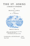
Title page recto: THE ST. JOHNS | A PARADE OF DIVERSITIES | [in italic] by | BRANCH CABELL | and | A. J. HANNA | [illustration in blue by Doris Lee] | [in italic] Illustrated by DORIS LEE | "And a voice heard from heaven said, Take | the little book which is open." |[in italic] ―The Revelation of St. John the Divine | FARRAR & RINEHART, INC. | [in italic] New York Toronto (see image above).
Title page verso: COPYRIGHT, 1943, BY JAMES BRANCH CABELL AND A. J. HANNA | PRINTED IN THE UNITED STATES OF AMERICA | BY J. J. LITTLE AND IVES COMPANY, NEW YORK | ALL RIGHTS RESERVED (see image above).
Publication:
New York: Farrar & Rinehart, Inc., September, 1943
Collation:
Crown octavo [21 cm. (8¼ in.) x 14.3 cm. (5⅝ in.)]; xii + 324 pp; (i) half-title (verso blank); (iii) list of titles in the Rivers of America series; (iv) series title page; (v) title page; (vi) publication data; (vii) dedication (verso blank); ix-x Contents; (xi) quotation (verso blank); (1) fly-title Part One; (2) illustration, The St. Johns River; 3-286 text; (287) fly-title, An Epilogue; (288) quotation; 289-303 text of Epilogue; 304-308 Acknowledgements at Large; 309-318 Bibliography; 319-324 Index. Pages (1), (157), and (287) are fly-titles.
Binding:
Ivory (also described as grey) cloth, blue printed label on spine; lettering and decorations on spine in gilt, front cover in blind; all edges trimmed, top stained blue. Spine: [in italic] The | Rivers of| America | [on blue printed label] [triple rule] THE | ST. JOHNS | [in italic] A Parade of | Diversities [triple rule] | [base of spine] FARRAR & | RINEHART. Front cover: [Rivers of America device in blind] (see image above).
Series Title:
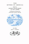
THE | RIVERS OF AMERICA | [in italic] Edited by | STEPHEN VINCENT BENÉT | and CARL CARMER | [in italic] As Planned and Started by | CONSTANCE LINDSAY SKINNER | [illustration in blue by Doris Lee] | [in italic] Art Editor | RUTH E. ANDERSON | [Rivers of America logo] (see image above).
Dedication:
[in italic] To the memory of | STEPHEN VINCENT BENÉT | [prose dedication in 6-lines] (see image above).
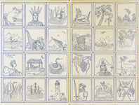
Endpapers:
Cream paper printed in blue; each pair of endpapers is diced into 24 rectangles, with a line drawing by Doris Lee in each (see image above).
Dust jacket:
White paper, black lettering on flaps and rear panel. Spine and front panel lettered in blue, black and white; blue background at top and bottom with a line drawing illustration on yellow ground between (see image above).
Spine: [yellow text on blue ground] THE | ST. JOHNS | [in italic] A PARADE OF DIVERSITIES | BRANCH CABELL & | A. J. HANNA | [illustration in black, yellow ground, by Doris Lee] | [black italic on blue ground] FARRAR & | RINEHART
Front panel: [on blue ground] [black italic] RIVERS OF AMERICA | [in white] THE ST. JOHNS | [yellow italic] A PARADE OF DIVERSITIES | [illustration in black, yellow ground, by Doris Lee] | [on blue ground] [in white] BRANCH CABELL & A. J. HANNA | [in yellow italic] ILLUSTRATED BY DORIS LEE
Rear panel: [blue rule] | [in italic] The critics say: | [3 quotations from reviews of the first printing] | [blue rule] | FARRAR & RINEHART, Inc. | New York Toronto
Front flap: [flush right] $2.50 | [centered] SECOND LARGE PRINTING | WAR EDITION | Complete text―Reduced Size | In accordance with paper conservation orders of the | War Production Board | [blue rule] | THE ST. JOHNS| [in italic] A PARADE OF DIVERSITIES | by | BRANCH CABELL | and | A. J. HANNA | [in italic] Illustrated by DORIS LEE | [14-line blurb in two paragraphs] | [in italic] (continued on back flap) | [blue rule] | FARRAR & RINEHART, Inc. | New York Toronto
Rear flap: [blue rule] | [in italic] (continued from front flap) | 27-line continuation of blurb in two paragraphs | [blue rule] | FARRAR & RINEHART, Inc. | New York Toronto
Notes:
Hall notes reports of this variant, which has the later printing text in a first issue binding, for both the second and third printings. He did not include this as a separate issue, though, presumably because he did not consider the evidence he'd received as sufficient support for doing so. We can now confirm this binding for both the second and third printings (or, at least, copies in dust jackets stating second and third printings).
The publication date was taken from the verso of the title page of the fifth printing, TSG-A5.
The second and third printings can be distinguished from the first by the lack of a publisher's device on the verso of the title page, and by the text on page 17, where line 14 begins As for the west bank... (see images above). According to Hall, Mr. Cabell has stated that there were textual changes made for each printing, but these have not been collated. At this point, the only way to differentiate between the second and third printings is by the dust jacket.